Additional Graphics
Supporting graphics and typographic treatments are design elements that can be used to add clarity to content, initiatives, offices or taglines that require extra clarification. They typically take the form of images, symbols or type treatments. Integrating supporting graphics in alignment with our brand strengthens both your materials and the overall brand identity of the campus. Here you’ll find guidance on how to incorporate CU Anschutz-branded supporting graphics into your marketing efforts. Guidance includes use of the elements for enhancing your unit logo or use as celebration marks that are distinct from official logos, as well as the use of these elements to promote events, clubs and groups.
CHECKLIST
All CU Anschutz communications and marketing must include the following:
| Correct name | |
| Approved logo | |
| Official colors | |
| Official typeface |
Typographic Treatment Guidelines
Some units may require more visually distinct identification. In lieu of secondary college, school, and unit-specific logos, the following parameters govern the creation and use of consistent typographic treatments for the promotion of university programs and offerings within these brand identity guidelines.
- The standard CU Anschutz campus logo must also be present on any material that includes the use of a typographic treatment.
- All treatments utilize the Helvetica Neue type family.
- Unique treatments may be developed through variations of type weight, size, color, and alignment. No other graphic elements or effects can be used.
- The only colors available for use in typographic treatments are BLACK, WHITE when reversed, and CU GOLD.
- Each typographic treatment, once created, must be used consistently and should not be altered with each use.
- Treatments may NOT be used in university website mastheads.
- Make sure to follow proper clear space between CU logo and and typographic treatment.
.png?sfvrsn=6e06ccbb_1)
Examples of Typographic Treatments


Supporting Graphics
Supporting graphics are design elements used to add clarity to subjects, content, initiatives or offices that may need extra clarification or communication of a tagline. A supporting graphic may manifest as an image, symbol or type treatment.
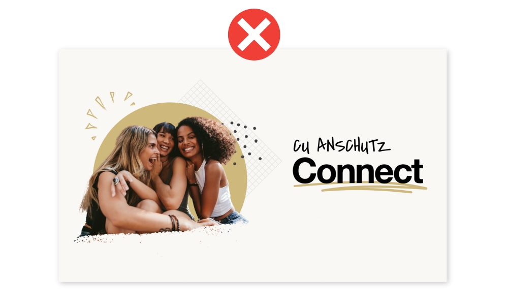
Supporting graphics are not for unit identification. They may not include any of CU’s approved marks, symbols (the CU icon, unit logos, university seal, spirit marks, etc.) as part of their design. Special care must be observed at all times to ensure viewers do not mistake them for a logo.

What Qualifies as a Supporting Graphic?
- A type treatment of a tagline for a specific office/department, initiative or event
- To highlight specific sections or areas of content (paragraphs, sections, bulleted lists)
- As a background element or pattern
- An image recognizing a milestone event or anniversary

Incorrect Use of Supporting Graphics
- As a primary identifier (AKA logo) for CU units, groups, or initiatives, and/or as a replacement for our campus, school or unit logos. This includes using the name of the university within the supporting graphic.
- Used without the CU logo on the same piece of artwork or email
- Combined or "locked up" with CU campus, school or unit names/logos
- Changing the colors or approved supporting graphic or changing the words in an approved type treatment
Use of additional graphics on apparel/swag
From time to time staff or students may wish to use custom graphics, illustrations or other designs on apparel and swag items to boost morale, fundraise or as event giveaways. It’s important that these graphics support the brand and not replace it so they must also follow the above guidelines. Special care must be taken to insure these graphics do not look like custom logos or as a primary identifier for a school/department/unit. Exceptions include registered campus student clubs, guidelines can be found here.
If you are unsure if a design meets brand standards and to avoid delays in production approvals, please reach out to brand@cuanschutz.edu.
Clear Space
Clear space must always surround the campus logo, to improve visual impact and ensure legibility.
The minimum acceptable clear space is equal to the height of the "U" in the interlocking CU icon as it appears in the campus logo.


Design Examples
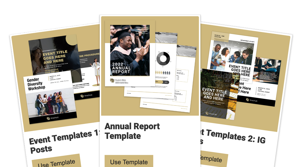
It is possible to stay in brand and create engaging and dynamic designs for your marketing projects. See below for some examples of using the brand to create varied and effective designs.
(1/6)
(2/6)
(3/6)
(4/6)
(5/6)
(6/6)