Digital Asset Accessibility
Digital accessibility refers to the design of digital content and platforms that can be used by everyone, including individuals with disabilities.
What follows is a guide outlining steps to make your digital assets for eComm, social media, image creation, web elements, etc., more accessible.
For more detailed information on web accessibility standards and next steps, please learn more here.
Why Accessibility Matters
- Inclusivity: We are a public institution committed to providing the latest news to the community in health sciences and as such need to ensure our content is equally and inclusively accessible to all.
- Legal Compliance: Adhering to accessibility standards helps you comply with Colorado Law HB21-1110, which requires higher education institutions in the state to adopt policies and procedures ensuring that digital communications and information technology are accessible to individuals with disabilities.
- Enhanced User Experience: Accessible design often leads to better overall usability.
- Wider Reach: Making content accessible can expand your audience, including individuals with disabilities and those using various devices and browsers.

Key Guidelines for Digital Asset Accessibility
1. Correct Use of Imagery
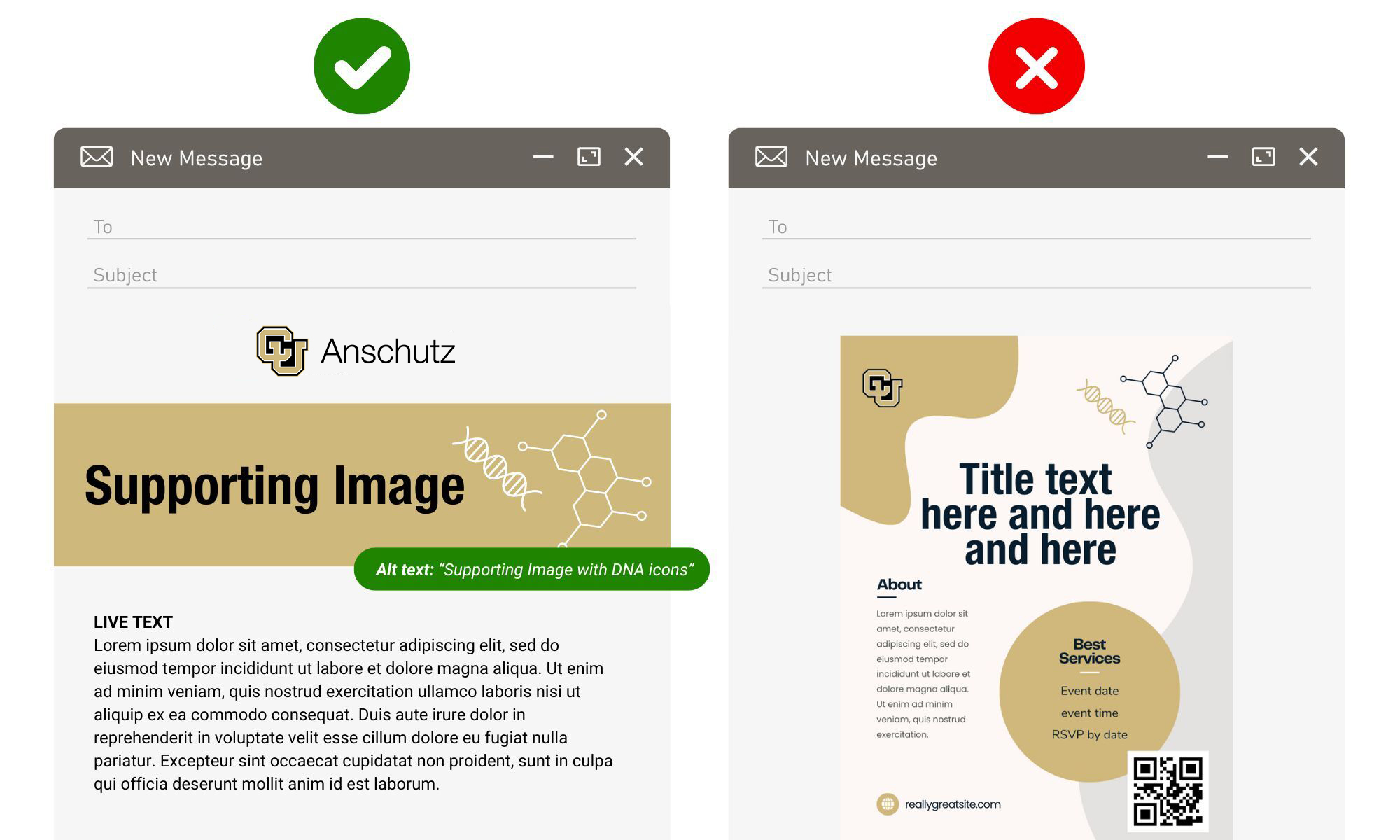
- Support Only: Use graphics and images to support email content, not replace it.
- Avoid Text: According to WCAG 2.1, images of text are not allowed. However, if an exception is needed for the design, make sure that the alt-text contains the exact same words and context as the text to convey the same message.
2. Use Descriptive Text Alternatives
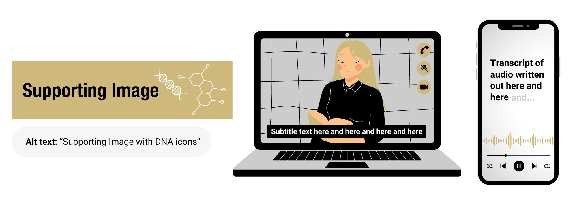
- Images: Provide descriptive alt text for images so screen readers can convey the content to visually impaired users.
- Videos: Include captions and transcripts for videos to aid those with hearing impairments.
- Audio: Include captions and transcripts for all audio to aid those with hearing impairments.
3. Design with Color Contrast in Mind
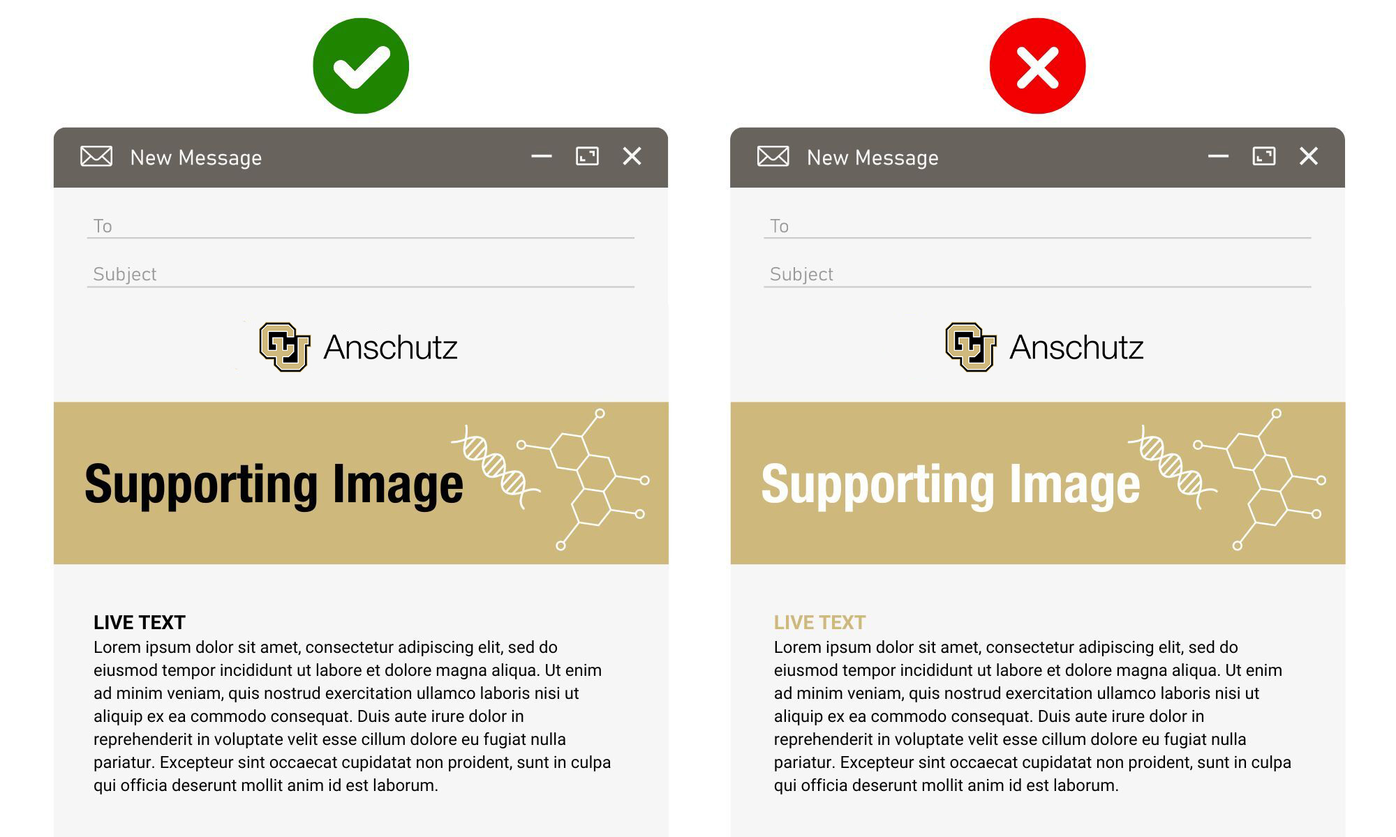
- Contrast Ratios: Ensure a strong contrast between text and background color for readability. Note: CU Gold on top of a white background is not accessible, and vice versa.
4. Create Structured Content
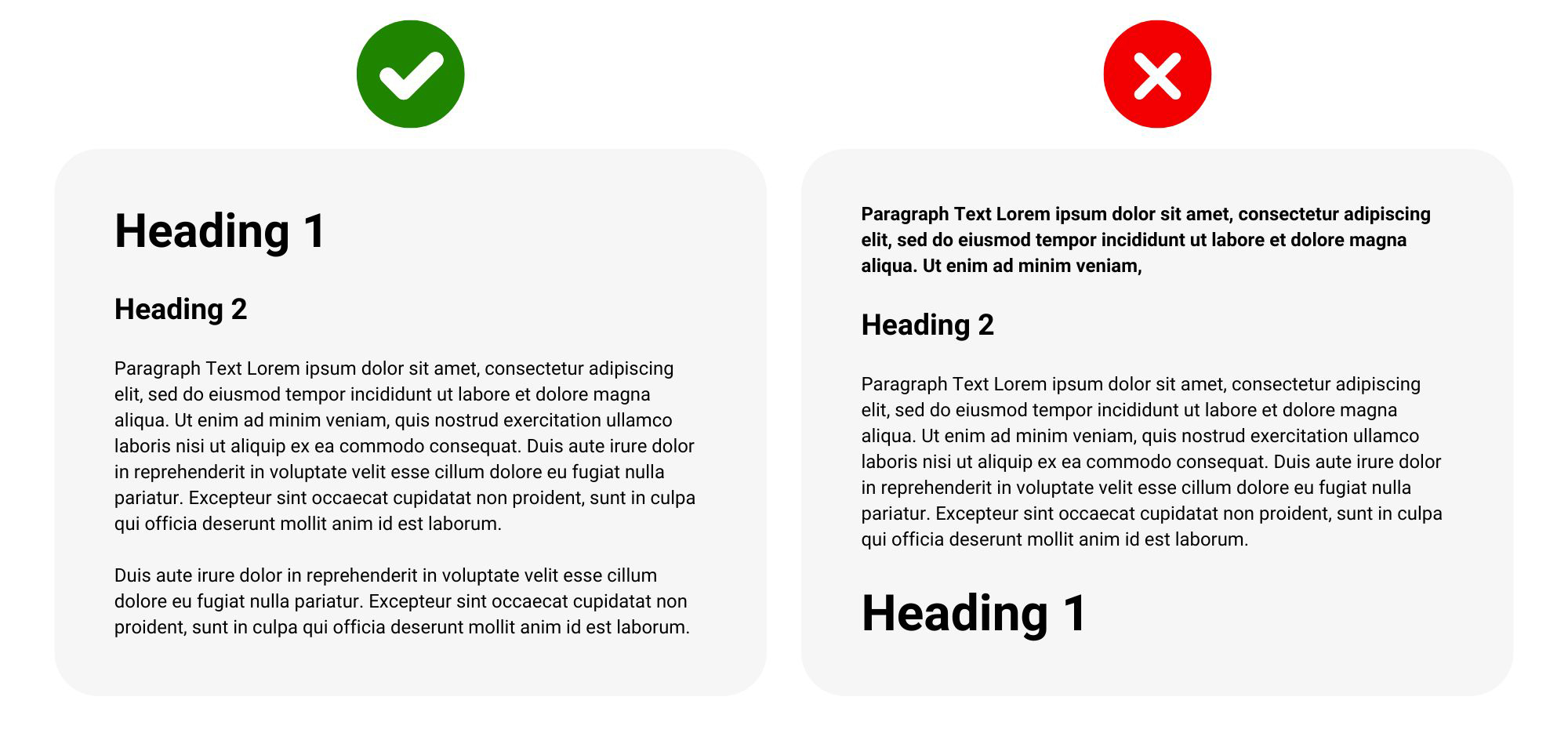
- Headings and Labels: When possible, use proper HTML tags (H1, H2, etc.) for headings to structure content logically.
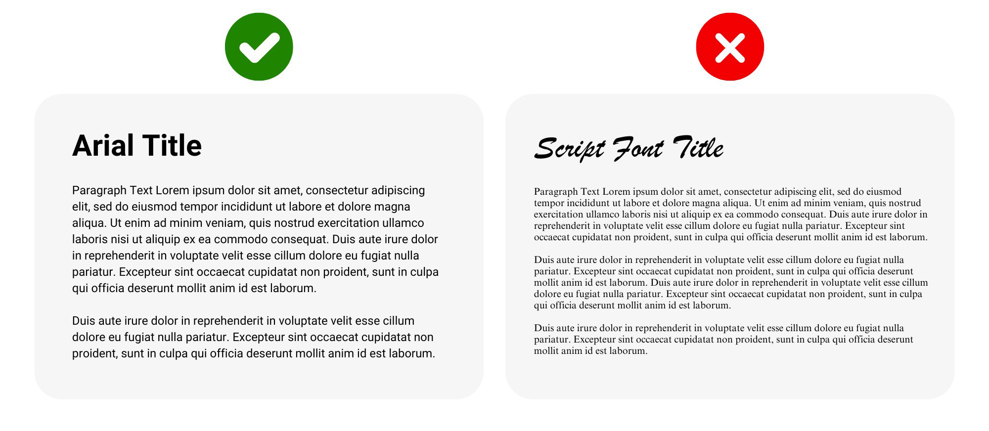
5. Ensure Legible and Easy-to-Read Fonts
- Font-Size: Ensure font-size is at least 14 points.
- Font Type: According to brand standards, Roboto and Arial are our preferred digital fonts.
- Line Spacing: 1.5 line spacing is preferred, due to the better readability.
6. Make Hyperlinks Accessible
- Descriptive: The link text should accurately describe where the link will lead the user.
- Easily Identifiable: Ensure the user can tell that it is a hyperlink by using different colors and text-decoration (i.e. blue font color and underlined).
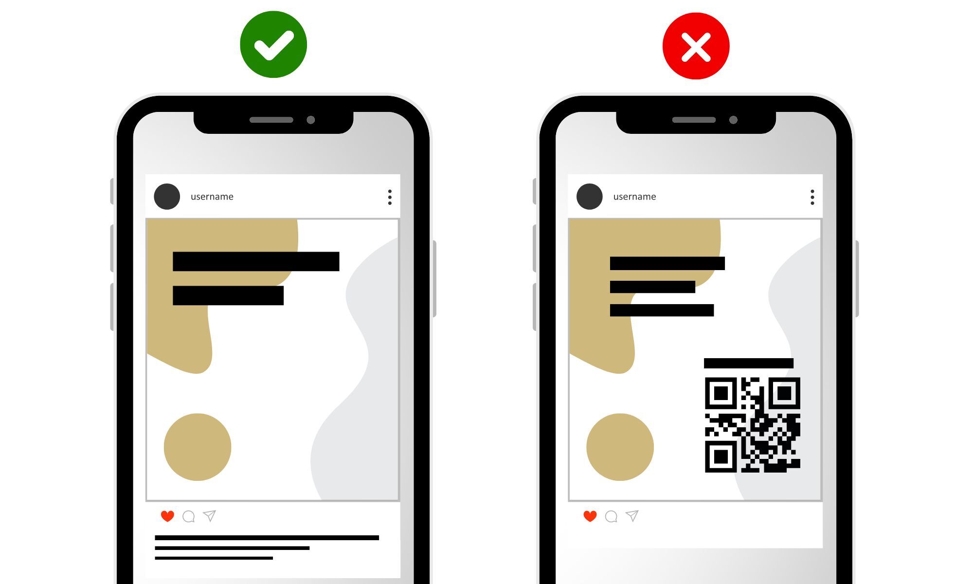
7. Avoid QR Codes
- Not Clickable: QR codes should be used to bridge the physical world to the digital world, so make sure you think twice before adding a QR code to a digital asset such as email communications or social media.
PLEASE NOTE: Downloading PDFs straight from Canva creates many digital accessibility issues. It is important to follow the steps on our Canva PDF workflow to ensure maximum accessibility.
Creating accessible digital assets is an ongoing improvement process, requiring both awareness and commitment. Adhering to these guidelines, ensures your digital content is accessible to all users – meeting state of Colorado legal requirements and ultimately fostering a more inclusive digital environment.
For more detailed information and resources on the digital accessibility initiative at CU Anschutz, visit the digital accessibility website, or please contact our support team at [email protected].

